The art of writing your name: Tilt & Egs

image

I asked Patrick Hartl and Christian Hundertmark the 2 cowriters of “The art of writing your name” to select an artist from their book and tell us a few words about him.

TILT by Patrick Hartl:

image
image


Patrick Hartl:” First of all because TILT is still an active graffiti vandal dropping his
stuff all over the globe and leaving his marks in every big city on this planet. The word Calligraffiti includes Graffiti, so to me it’s just a matter of course that Calligraffiti artists should have some Graffiti background – and TILT is the very best example for that. His style is pure Graffiti attitude, classic tags and throw ups – the language of the street perfected to the limit. I simply love that.“

EGS by Christian Hundertmark:

image
image


Christian Hundertmark: “While working on the book Patrick and I agreed that it is really important to cover the whole spectrum of urban calligraphy writing, not only the well known calligraphy but also the more abstract style. We aimed on more versatility than showing the typical stereotypes. Another important point was that this book had to be international and not showing works from artists from just one country. Sometimes this was a difficult task as i.e. in France you find a lot of artists doing urban calligraphy while in other parts of the world like Finland you find less (or we didn’t know about them). This also lead to the fact that some artists you maybe expect to be featured in this book could be missing but this was due to a tough selection process.

Back to EGS: Since both Patrick and I used to be active graffiti writers in the early 90ies painting trains we also knew about EGSs graffiti works back then
and had followed his career over the years. So it was clear he had to be featured in this book representing the very abstract side of urban calligraphy in combination with being an authentic graffiti writer.“

The art of writing your name – 288 pages – english – 2017

Continue reading
0 Comments

The Art of Rebellion IV – interview

Christian Hundertmark aka C100 author of The Art of Rebellion books shared a few words with us 13 years after the 1st AOR book.

image

– When you wrote the 1st Art Of Rebellion in 2004, the goal was to
present that new post-hip-hop-graffiti scene also known as street-art.
What is “Art of Rebellion 4” about ?

In general it’s the same topic as the previous ones: introducing street art / graffiti to a wider audience. But this time with a new approach: Instead of just documenting / introducing the most interesting new works I asked each artist to select his most favorite work and write a short text why they had chosen the particular piece. This led to really interesting results which gives the reader a new insight on each artists work concept.

image


– According to you what are the biggest changes the urban-art scene have experienced last decade ?

In my personal humble opinion I’d say that street art made a very
successful step in terms of attracting recognition from people outside
the scene which had both positive and negative aspects. I mean nowadays everyone knows what street art is…! One one hand that’s a great development as many artists got the chance to step into the contemporary art world, doing big art shows in galleries and can make a good living out of it etc., which I think is nice as it proofs that this young art form got the respect it definitely deserved. On the other hand it got a bit predictable, some artists works got very hyped even though their work weren’t very inventive and more or less unambitious.The use of stereotypes seemed like there was a ultimate street art cook recipe: Some drips here, some sampling of pop art there, some punk attitude and there you have the street artist the audience expect to be the next Banksy…. which I think is a bit lame.Still in general I think the quality of the works made a huge step!

image

– When I compare the photos of the 1st AOR and the new one, what I notice is that nowadays many artworks are huge and legal. Nowadays the
urban-scene seems to be run mainly by professionals. Is the title “Art
of Rebellion” still accurate ? And has the street-art scene been really rebellious one day ?

Yes, this is a justified question and I think if it wasn’t a series considering another title would make sense :) but if you start form the basis each artist featured has street credibility and authenticity. Most of them still work in the streets illegally which could be contemplated as a rebellious act in a way, too. Still, I’m aware that „real" rebellion is connected to much more radical acting but I think the title is a great wordplay which makes totally sense in this context of art. Also I’d like to add that by asking the artists for their most favorite artwork they ever did anything would have been possible. And this is what happened in the end. This book is more like an opener for the viewer to get into the whole work portfolio of each featured artist. I.e. Honets feature (both photo & text), which is one of my favorites, it’s essential that you know both what his current works AND his background from day one. I’m really happy that this concept worked out so good.

image


– In the book we can see people work that were in the previous books, but also new artists. Can you tell us a few names of people you discovered recently and enjoy the work ? (they don’t need to be in AOR4)

I discovered the work of Hayden Kays, Hot Tea, Maser and Mobstr during the process. Even though others maybe knew their works before I got into their art more or less by chance and I’m really happy to have them in the book!

image


– Like many of us I like good punchlines and slogans written on walls or on stickers. Under your C100 alias, you did excellent “Cash rules ruins everything around me” posters. That was an instant-classic to me. But I
discovered in AOR4 that crazy story about the Wu-tang trying to sell
copies of your work claiming it was an original work from Banksy. Could you sum-up this unbelievable story ?

Haha, yes to say it in one sentence: Wutang tried to fool the internet by telling that „The Cash ruins everything around me“ poster was done by Banksy and selling it as a limited screen print for 100$ as a Wutang/Banksy collab – and I found out about it! As
everyone knows, if you have Banksy involved the attention and value of a print will rise exorbitantly and very fast hence it’s much easier to sell…. The problem was that someone send me the link to that post on the Wu Disciples Blog and I found out about this hoax. In the very beginning the screenprint also had a Banksy Logo on it! Unfortunately I didn’t make a screenshot of this. After a few emails back and forth with Wu Disciples manager we agreed to make a screenprints with the original artist (me) and donate the earned money to “Doctors without Borders” but even though I organised everything at one point I didn’t got any more replies and it came to nothing. Luckily the internet doesn’t forget, so did I :) and when working on the book I found almost all links that proof the truth of this unbelievable story.

image


– Do you expect to do an “Art of Rebellion 5” one day ?

I think it’s the same answer like for the last 4 books: Maybe, …we’ll see what happens. But I can imagine that this can happen, for now I’m happy with the latest result :)
Thanks for the interview!

The Art of Rebellion #4
216 pages – English- ISBN: 978-3-939566-49-6
About 35€ – Available at Stylefile

Continue reading
0 Comments

ROWDY interview

image

I took advantage of the release of Get Rowdy by Rowdy from Bristol to ask him a few questions about his book, his work and his city.

– Can you present yourself? How did it all begin?

Well attached is the 1st actual Rowdy piece I did in Bristol in 1992 taken from someone’s (graffarty) instagram . I had different tags from 87 up until this point.

image

– Get Rowdy book is about your works from the last 7 years. You started in the late eighties. With such a long carrier, haven’t you been tempted to show your earlier works?

Of course it would be nice to show earlier work, much of which was actually destroyed due to a studio fire back in 2010. I was looking for narrative and wanted to show where my head is currently at, in terms of being a creative. 

image

Has it been difficult to select the photos ?

It’s frustrating when you have done a cool piece and the photo’s don’t quite cut it. I think for this reason it was absolutely integral for the book to have Alex Ellison on board his work is mainly focused around London being the modern graffiti archivist he is very meticulous in his endeavors and captures a phenomenal amount of writers transient work and his night shots are stunning.

image

– Cats, rats and birds are popular animals on the walls. Do you remember how your obsession with crocodile started ?

Playing & painting in Quarries was the catalyst, dwelling in the underground space gets you thinking about creatures like fossils and crocodiles. Given the fact these vast clearances of the land pave the way for our roads and Cities helped me focus on the Ancient V Modern. Initially I decided to paint various creatures on some of the large remaining boulders one of the 1st being a Crocodile circa 2003. I went on to make several installations in different quarries during the mid naughties and not long after this I took the Croc to the streets.There were already cats like La Mano and Pez doing the logo bombing thing not to mention Keith Haring way back plus characters had always been a big part of my repertoire during my graff years. I just wanted to connect with a different audience whilst retaining a fairly hardcore graffiti aesthetic what’s more the quarry work wasn’t getting the attention of the usual graff watchers and I liked this, it was a great time as you know so much was happening and practitioners were pushing our beloved art form in all kinds of directions back then, and I didn’t feel to cynical about it as I do sometimes these days.

image

– You collaborate very often with friends like Sweet toof or Goldpeg. What do you like most, painting alone or with other people?

The shared experience of being wild and having fun is such a buzz. It helps set you free from the mental torment you have to endure on your own as an artist in say the studio or the business world. The crew helps validate each others work.On the other hand when alone there is the chance to really get in the zone see how far you can push things, this particularly applies to my abstract work.

image

– In the book you present some abstract works I didn’t know from you. This is really different than your graffiti work. Have you ever thought about painting such pieces outside?

On a couple of occasions this work has appeared outdoors and maybe I will revisit that idea again at some point ultimately I just wanted to keep something back for myself that couldn’t so easily be ripped,buffed or written over. To have some longevity in the contemporary art world as well as in peoples homes, slightly more conventional I guess but there again try being an abstract artist in Britain?

I’m also interested in some of the parallels between wildstyle graffiti and abstract art, many don’t like their street art too complicated so in a sense it provides a nice counter balance to my Croc work.

image

– Bristol graffiti scene has always been known worldwide thanks to 3D featured in Spray Can art book, and of course more recently because of Banksy.
According to you has all this attention to Bristol graffiti scene been a good thing ?
(Little story, a colleague who has absolutely no particular interest in graffiti or graphic design went to Bristol last summer. He told me the best thing about his holidays was the Bristol street-art tour he paid…)

Bristol has a fantastic history and it’s a shame 3D’s pieces never got the same Banksy heritage status but how could they given the times, I guess for me that’s why the book is a form of preservation. Jon Nation who works on some of the tours is undoubtedly a recommendation as far as I’m concerned as he’s a proper Bristolian and been around for time and a big supporter to all concerned. So yeah I would suggest it’s well worth a visit and the pound is now weaker due to Brexit. There are types trying to regulate our scene having never come from an Art/ Graffiti background offering up walls that are looking some what watered down or trying to hard in their approach . Generally it’s a good mix here but as property prices rocket we need more Artist lead projects if we want credible art in the City and hope the vandals don’t get caught going about their activity.

image

– If you could explore and paint anywhere in the world, where would you go and why?

I’ve still not been to Lisbon, I think a spell in Canada could be nice. Many of my abstract works are a form of travel, fictional and imagined locations I’ve never been to like Franz Kafka’s vivid description of an America he never visited.

– What do you do when you’re not painting?

Think about painting.

www.getrowdy.info/

Continue reading
0 Comments

HENDRIK ECB BEIKIRCH Interview + Book preview

image

Can you present yourself? What initially brought you to graffiti? And when did you make the transition to painting portraits?
Hendrik ecb Beikirch, traveling the world. Currently living and working in Koblenz, Germany.
I started in 1989 with classical graffiti, but within a short while changed to more of a unique approach.
Back then my concepts where more focused on graphical shapes whereas nowadays the ideas of my work have more of a fine art approach focusing on textures, showing expression within my portraits through a more painterly means rather than just using spray.

image

Who are the people you paint?
In both my large-scale murals and canvases, I want to paint people whose faces tell a story; therefore I take inspiration from accidental and brief encounters.
Taking life back to the streets. Real expressions, faces with stories to tell.
Digital media has changed the way we see beauty anyway. Most faces we see printed in public like on billboards or ads appear unnatural.

image

Are your faces always related to the place where you paint them?
The faces are not always related to the place where they are painted.
The portrait has to fit the wall and vice versa, this is a lot about that first feeling.
From a distance, I hope it reads as photo-realistic perfection, yet somewhat unreal due to the drips and abstract textures.
My goal is one should relate so much to the painting from afar, that once he/she stands close, it becomes vague and abstract again.

image

Can you tell us what we will find in your book: Blurring Boundaries ? 

Blurring Boundaries

documents on 208 pages my achievements of the last years. It captures the two fields I worked on: Fictional faces and portraits of real people, both on walls and on canvas.

Was it difficult to select the photos for the book?

As I do spend a lot of time on the photographic documentation of my woks it was kind of tough to select the best photos.

You’re known for painting large scale paintings. I can imagine it is very satisfying when the work is done. But do you really take fun painting these big walls?
It is what I love to do. In fact painting big walls is relief and fun all at once for me.
When I am in the cherry picker basket – even if I paint quite fast, like doing the side of a 12 story building in three days – a day is less hectic and stressful just like when smoking from a CBD Cartridge.
If it comes to art in public space I believe you got two options to go for: Clandestine, small, hidden and tiny or as big or tall as it can get.
Art has to compete with architecture, advertisements, and passers-by attention in busy city streets.
You only got a few seconds to catch the attention, to get this first impact.
That’s why I go for the bigger the better.

image

 When you have been asked to paint that 70m high wall in South Korea, have you instantly accepted or have you hesitated?
When I first saw a photo of the wall, I was instantly stoked. Arriving at the site it was even better.
The Daniel Libeskind skyscrapers in the background offered a perfect background, both on an aesthetically and content level.

I can imagine you don’t suffer from vertigo… ?
I don’t suffer from vertigo, but as the cherry picker basket was open on the front the view down was something I had to get used to.

Are you sometimes tempted by adding colors to your portraits ?
No, not really.
If it comes to capture emotions in a portrait I think black and white is the best way to go, plus with the big walls you have to break it down to a only a few shades anyway.
And just black and white are so strong by themselves..

image

What does inspire you, and who’s work are you into?
My art teacher in school had lived in NYC in the early eighties.
In our drawing room hung a poster he had brought from over there with photos of painted subway cars on it. I was totally fascinated by the Lee Quinones “Stop the Bomb” wholecar.
Besides that the installation Gottfried Helnwein did in Cologne in 1988 in memory of “Kristallnacht” (The Night of Broken Glass 1938).  A hundred meter long wall of pictures with large images of children’s faces, in a seemingly endless row. When I saw this back then it blew my mind.
Nowadays Gerhard Richter for his realism and diversity.
Richard Serra for combining art and physical experience as well as for the way he works with public space.

Where do you see yourself in 10 years?
Nothing last forever.
In the end all you have is what you stood for. I am trying to get this right.

BLURRING BOUNDARIES by Hendrik ecb Beikirch
208 full color pages
Publikat Publishing
ISBN: 978-3-939566-32-8

Continue reading
0 Comments

ZOMBIE LOVE – WON ABC Interview

image Zombie love

Won ABC has just released Zombie Love a new book published by Publikat. I took advantage of the book to ask to Won -a true european graffiti pioneer and zombie fan- a few questions.

Can you present yourself? What initially brought you to graffiti? When did you get down with ABC crew?

Hi, my name is WON from ABC crew Munich Germany. I started graf in 1984 like most europeans by the legendary film Wildstyle. I founded the abc crew in 1987 together with Cowboy 69 from Munich.

What does inspire you, and who’s work are you into?

Most inspiration comes by travelling around the world and life itself. Visual artists i like are: Hieronymus Bosch, Caravaggio, Robert Williams, Mucha, Michelangelo, Goya, HR Giger, Robin Page, Dürer, Leonardo Da Vinci, Simon Bisley, Bode, Milo Manara ….and some more.


image

You’ve been painting for such a long time. How did the way you see graffiti change over the years?

It became large over the world over the years, but it still does not get the respect it should earn.. but time will come soon.


image

I do remember when I saw for the 1st time on a magazine your famous dragon end-to-end. It has been a real shock for many of us. Can you tell us a bit about this piece?

I did 2 parts on train of that steel ta2 dragons in 1993, the third one was unfinished only outlines cause I had to escape , the main thing was to fill up a big surface on a train by just an image and not with letters, steel ta2 was a symbol for ta2ing trains with Canz.


image

I think you have been able to paint it again?

That is a funny story. The blue dragon was running for one week then the authorities buffed only the face of the dragon and let the train run damaged again, some day later I was so lucky by accident to find exactly this one in a train-yard and repainted it like before, but I forget one tooth, in my book colour kamikaze you can see both versions…just count the teeth.


image

There are 2 part in your new book “Zombie Love”. The 1st one is illustrations/comics about Zombies, and the 2nd one is about your graffiti work. Can you tell us the concept, or at least the idea of this book?

ZOMBIELOVE story covers 73 pages. Chapter one sets the scene for a zombie story in 2101, featuring a versatile character through various types and techniques of illustration. A scientist accidentally brings dead people back to life. The problem this creates for the citizens of Paracity goes beyond the zombies’ passion for graffiti and vandalism. By biting humans the zombies multiply and become a zombie epidemic, which soon threatens to exterminate humanity.
The second chapter of the book features an 80-page retrospective of  my work over the last 13 years in symbiosis with the storyline of ZOMBIELOVE. There are paintings, sculptures, train graffiti and other activities. Countries such as the United States, Cuba, Jamaica and many more have been infected…

 On the 2nd part of the book, we can see many photos of your graffiti work with you or friends wearing zombie masks. Do you make the masks yourself?

 Half and half, I modified existing masks the way they should look, an easy and fast way for me.


image

At the beginning of the book, there’s an enthusiastic message of one of your art-school teacher. What did the time spend at the Royal Academy of fine Arts in Munich bring to you?

He is a good friend of mine. At the Royal Academy of fine Arts in Munich I was able to realize my projects for 6 years without thinking too much about money with the student status I got some money each month, I only went there for half an year for some lessons, you had to do no tests. My teacher told me we can drink and paint together but this school system is shit. And that is true. You cannot learn to become an artist.

If I visited Munich, which are the places I shouldn’t miss?

Octoberfest and my studio.

Are you busy with any new projects you can tell us about?

I have plans for a new book about travelling, animals and plants the rest is secret….


image

And finally can you list your best 3 zombie movies?

All stuff from George Romero, Nosferatu from Fritz Lang, and some stuff from Lucio Fulci.


Continue reading
0 Comments

Ruedione’s Backflashes

back_1

Please introduce yourself. Where are you from? When did you start photography? Did you paint before starting photography?

My name is Ruediger Glatz aka Ruedione and i come from the beautiful city of Heidelberg in Germany.

Like many people I’ve shot photos my whole life.  When i was 7-8 I had as well some darkroom moments with my father, but the real start of my photography was in 2000…soon i became a photonerd.

I started to write around `91 but slowed down around `98….today I piece just once a while, but can’t claim myself being an active writer.
My focus is on my photography

back_3

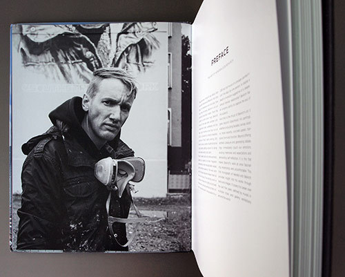
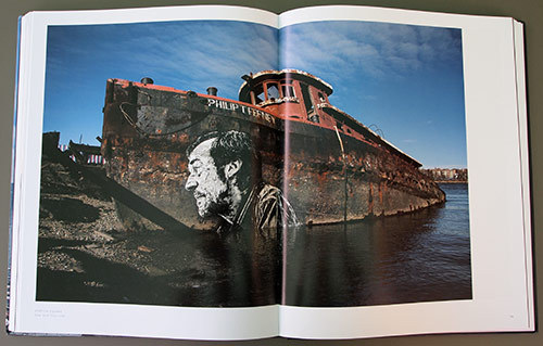
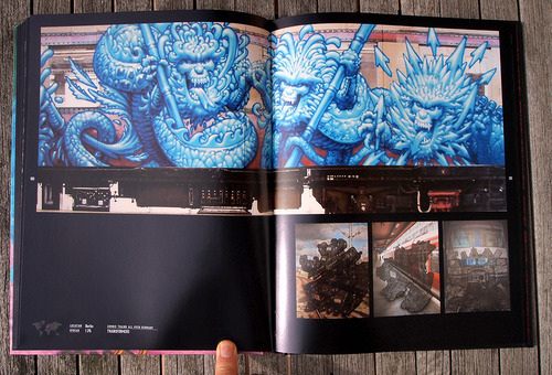
Backflashes is a big book with large pages and only 1 big photo per page. Was it important that your photos were presented on such a big format?

The book was still a compromise for me….if it was only on me, i would have put just one image per doublepage, but i was as well grateful to the publisher, as doing such an uncommercial book in this period of time, while tons of graff books come on the market and most sell way less, than they used to sell, is a certain risk I appreciate a lot.

indeed…this kind of presentation was important to as I want to see my “babies” getting the right focus.  The composition of an image is very important to me…normally i don’t crop my images. I go even so far, that the images in the book, that go over a doublepage and had get cropped for that, fall in my eyes under grafic design and are no more part of my photos in that book.

I personally don’t crop to push myself becoming better. With crops you can easily optimize your images and you don’t  have to focus much while shooting.

The presentation of my images is quiet an emotional point for me.

back_4

Your photos are all in black & white and some are a bit noisy. They look like film photography. And it works great for night photos. Do you like the current trend of clinical precision that allow digital photos? (and by the way, do you actually use digital cameras?)

When I started this series in 2002 I was strictly shooting film and the T-MAX3200 gave me the needed speed to shoot this series. I like the grainy and raw look of this film and had the feeling, that this format was supporting my look.

In 2005 i switched to digital, as the first camera came on the market, that gave obviously better results than film plus i found a mentor who opened my eyes for a certain general view on photography.

…but i kept the same look for the series.

Today I shoot mostly digital, but use film for some series.  I experiment a lot with all kind of cameras and always try to push limits.

I am very grateful for the possibilities, that the digital photography gave me, the same time you have to be aware of all kind of risks, that come with that medium.

When i shoot a series i always make up my mind first, what kind of style is underlining my message. I do shoot as well “technical perfect and precise” digital images, but for most of my series i use a retro look, as it gives me the emotional intensity, that i always look for in my images.

back_5

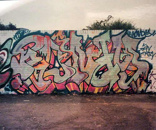
Backflashes must be one of the 1st books about graffiti where it is not shown a single graffiti. Is it a way for you to tell that adrenalin, friendship, tension, & night-missions are what really matters in the graffiti?

I see my book being the second book, as Alex Fakso published his HEAVY METAL in 2006.

My aim was to visualize that feeling that kept me going out at night for so many years. Graffiti -and specifically bombing- influenced my life a lot and i wanted to preserve that precious feeling for me and others, that might be interested in grabbing the book in 10-20-30 years and get a backflash.

The way i chose to shoot the series in, has the focus completely on the feeling….the identities of the persons are totally not relevant…it is even important for me, that they are not being recognized, as graffiti is a movement, that creates idols, who might disturb what I was looking for.

In a way i think that the community aspect of graffiti is probably the most important factor to me, that made this movement so special to me, but this is somehow what my next book is about…i am already working on for 7 years. BACKFLASHES is all about the bombing-feeling itself.

…a piece made for night-lovers.

back_6

As a former graffiti writer, is it frustrating sometimes to take some risks with people in front of a train and not painting on it?

It is funny…it seems that this is the question almost everybody asks me. The answer is quite simple. Photography is no different than writing for me. It is about style and achieving aims, therefore I always saw myself as part of the production, but in another way. While i spent formerly 7-8 hours on a mission plus had to chase in the morning trains (what was as well special to me) to get my piece, i join today the production and have mostly 10-20 masterpieces in a very basic format on me. Those I can finish in the perfect moment. You could compare it to a writer, who does his firstlines and fills in the yard, but is able to do his outlines at home.

This was always a wonderful way of working for me.

As well i was never able to satisfy my personal view on quality and style in writing, while i am able to do so in my photography. Of course there still has to be a certain challenge, to be able to evolve, but i love my images and it feel like carrying home babies.

back_7

Which photographers do you admire most? Did some of them influence your own style?

I wouldn’t say that there is a specific photographer, who influenced my style or who i even admire.

When i started in 2000 very soon the images and the approach of MAGNUM photographers like Bresson, Burri and Capa influenced me, but over the years i had the feeling something was missing and it were finally images of the American civil war and other vintage prints, that showed me what i was seeking for.. that influence added darkened edges and a certain retro look to my style. Somehow the opposite of what seems to be perfect to the most is perfect to me … it gives warmth and emotional focus on details to my images and this is what was a bit missing before. I never wanted my photography to be neutral.

Several years ago the concept of “stars” faded for me and today i don’t see any photographer or “star” in general, who I would like to switch life with…i enjoy my life.

ruedione

Is this book the end of a period of you life? Do you still shoot graffiti writers or like Alex Fakso you are now experiencing new photographic themes?

I would say that this book was about a former period of my life, that was even over, when i started shooting…so i called it BACKFLASHES.

Since i started taking photos, the challenge of learning was always a very important matter to me. Therefore i shoot since years as well photos in other directions than graffiti, but i like to separate things. About 4-5 years ago i started to work also as a photographer, but what i shoot job wise has nothing to do with my personal work…but it keeps me learning.

Next to BACKFLASHES i have other long term projects i was working on, and since i finished BACKFLASHES in December 2008, i focus on my series ARTISTS (just a workingtitle), that i started shooting for in 2002-2003.  Here i shoot portraits of around 90-95 protagonists of the graffitimovement. I join them sometimes for a couple days and the focus is on the person and their living environment…this series should be finished by the end of 2010.

…but there are a couple more series. I am addicted to shoot and i enjoy it a lot.

ruedione

And a last one if I visited Heidelberg, which are the places I shouldn’t miss?

It depends on the day, but for sure you shouldn’t miss the ZUCKERLADEN …a crazy candystore with a crazy owner.

I always call Heidelberg “happy land” as everything seems to be alright and good.

backflashessss

http://www.ruedione.com/
http://www.backflashes.com/

backflashes book

Continue reading
8 Comments

Part of the Rebellion #1 – Flying Förtress by C100

C100 published 5 years ago; “The art of Rebellion“,
the 1st book about the so-called “street-art scene” of the early 00’s.
He’s back with a new book collection…

“Part Of The Rebellion: Flying Fortress” seems to be the 1st book of a new collection.
Why have you choosen Flying Fortress for this 1st book ?

First, he is a good friend of mine – we know each other since we started with traditional graffiti in ’89 or so.
We both got into street art again in 2000 after a few less active graffiti years and did some stuff together.
And: his art is perfect to introduce the concept of the book to the audience as he both still works on the streets, exhibits in galleries  and also does commercial work.
Also, he is well known worldwide and stands for good quality so there is a chance people probably buy the book :-)
Do you already have selected the next artists for the future books ?
Yes we have, but some aren’t 100% confirmed so I can’t tell you more at the moment. Currently I’m working on #2 with Dave the Chimp – it’s a honor for me as I really love his work.
I can guarantee that people will be stoked about his new works! It’s coming out in Spring 09 and after that #3 will be out in Summer 09…
We planned to bring out 3 books per year.
Does the book company wait to see if FF book is a best-seller before
launching a 2nd book ?

No we immediately started working on #2. The book company are personal friends of mine, we know each other from the graffiti days in the early 90s.
They are totally into it – they don’t do it only for the money, so do I. We just think this is the perfect strike against all those cheap but low quality books that are thrown on the market where one guy just walks through i.e. Berlin or London – takes a few photos and doesn’t even care about any artist credits or what he is photographing…

We want to do proper art books to show that this is a true art form.

Art of Rebellion was released about 5 years ago now. Do the street-art
scene has changed a lot according to you ? Is it better now than it used
to be ?
Hmm. that’s a difficult question – it definitely has changed both in a good and bad way.
There are artists who now can make a living out of their art, which I think is a great thing.
The are great exhibitions, etc.
I think the quality level  is still good & even progressing! Sometimes there are still works/ideas/concepts that totally suprise me – that’s when I think: Damn I wish I had had the idea ;-).
In the end I’m glad that the expected trend of street art wasn’t that big. There was a time when everyone was doing stickers and called himself an artist which was pretty lame –
luckily this calmed down. Nowadays, there is less street art to be found in the cities compared to 5 years ago, which is also due to new laws and cleaning programs (R.I.P Barcelona) but still you see good stuff every now and then. It’s all good!

http://www.flying-fortress.de/
http://www.publikat.de/
http://www.c100studio.com/

Size : 15×18.8cm – Pages 128 – 14.90€ – Isbn: 978-3-939566-16-8 – English – Softcover

Continue reading
13 Comments

Graffiti Writing [fr]

Origini, Significati, Tecniche e protagonisti in Italia.

Interview avec Alessandro Mininno

L’idée de départ de ce livre, c’etait de faire le bouquin définitif sur le graffiti en Italie ?

Non ! Tu ne peux pas faire un livre définitif sur quelque chose qui n’est pas encore terminé (de la même manière il ne peut pas y’avoir de livre définitif sur l’art contemporain par exemple). « Graffiti Writing » est un livre de présentation du graffiti : C’est sensé être lisible par la plus grande audience possible. Les gens ont tendance à détester ce qu’ils ne comprennent pas : J’ai écrit ce livre avec l’espoir qu’il permette aux gens de commencer à comprendre et à lire les tags et les graffs. Qu’ils aiment ou pas, peu importe – même si personnellement je trouve toujours beaucoup de beauté dans un tag, et je voulais montrer de beaux panels et throw-ups et expliquer ce qu’il se cache derrière.

Graffiti est un mot italien, mais “Graffiti Writing” ça fait pas trop titre de bouquin sur le graffiti italien non ?

J’aime pas le mot “graffiti” seul, mais il fallait qu’il soit présent pour faciliter l’indexation du livre et les recherche sur le sujet. C’est pourquoi j’ai utilisé l’expression « graffiti writing ». Dans « Subway Art », ils disent « Le Graffiti writing à New York est une vocation qui se passe d’une jeune génération à la suivante… ». Le livre est sur le « graffiti writing », pas sur les graffiti d’amoureux (C+F= Amour Eternel), ni sur le graffiti politique, de football des catacombes ou autre.

Dans les années 90, Rome et l’Italie étaient connues pour être de bons endroits pour peindre des wagons. Les compagnies ferroviaires n’effaçaient pas vraiment les graffs. Quelle est la situation actuelle ?

Je pense que l’Italie est toujours un bon endroit pour peindre des trains, mais tu sais probablement que depuis 1999, les trains sont nettoyés facilement et rapidement grâce à des films plastiques transparents apposés sur les wagons. Ça a été un changement radical de mentalité : Avant 2000, tu peignais pour voir ta pièce tourner pendant des années. Maintenant les gens peignent principalement pour l’action, prendre une photo de sa pièce est plus important. C’est difficile désormais de voir un wagon peint car ils ont une durée de vie limitée. Il faut beaucoup peindre pour se faire remarquer. C’est devenu un sport complètement différent (c’est désormais comme dans le reste de l’Europe je pense).
Des centaines de gens peignent toujours des trains en Italie, et on peut quand même voir des productions de qualité dans les gares. Beaucoup d’anciens se sont remis à peindre cette année, et je suis très content de voir à nouveau des trains de Hekto, Napal ou Rok par exemple.

Y’a vraiment beaucoup de photos dans “Graffiti Writing” d’où viennent elles ?

Sara et moi avons demandé les 250 et quelques photos du livre directement aux “writers”. 


On a récupéré autour de 5000 photos. Avec Sara ont a des goûts complètement différents donc choisir les photos à publier a été assez difficile.
Je voudrais remercier tous les « writers » qui nous ont donné des photos… sans eux le livre n’aurait pas pu exister. On a reçu BEAUCOUP de super photos de bons photographes aussi (la liste ici)
Le livre ne représente pas la scène Italienne (c’est impossible dans un livre, y’a les magazines pour ça). Les livres essaient de montrer des styles (throw ups, tags, whole cars, etc.) de raconter des anecdotes, de la manière la plus scientifique possible. Je voulais faire un livre accessible sur les trains, les tags, les throw ups : Il y a déjà tout un tas de livre hyper spécialisés sur le graffiti (je les lis) mais je pense qu’ils sont trop codés pour la plupart des gens. D’un autre coté tu as les livres qui montrent que les « hall of fame », des persos, c’est plus facile à vendre mais je ne les aime pas. (je déteste particulièrement les grosse compiles/collages du style « Graffiti World »). J’ai eu la possibilité de faire quelque chose qui représente mon propre point de vue sur le graffiti : les lettres, les trains et le vandalisme. J’espère que quelqu’un va le descendre, le critiquer – on a va fait des choix et on est prêt à les défendre.

Peux tu nous citer le nom d’un graffeur italien qu’on ne connait certainement pas, et qui mérite un peu de publicité, d’exposition ?
Non je ne peux pas.
Je pourrais te citer mes « writers » préférés, mais ce sont mes goûts persos…ça signifie rien. Je pense que la seule façon de savoir ce qui défonce en Italie, c’est de faire un petit séjour à Rome ou Milan, et de marcher dans les rues, ou choisir un bon banc dans une station. Il faut toujours se rappeler que ce qu’on voit sur un internet ce n’est qu’une infime partie de ce qui existe… et pas toujours la meilleure :-)

Peux tu choisir 5 pages du livre et nous en dire 2 mots ?

Pour débuter, j’aime vraiment cette page où Verbo (Meta2) peint pendant la manifestation du G8. On peut effectivement voir la foule qui défile dans le fond. Je pense que cette documentation a une valeur inestimable (la photo est de Olafpix.net).

C’est la même raison pour laquelle j’aime cette photo d’Alex Fakso où les gens enlèvent la protection plastique contre les graffs sur les wagons avec des cutters. Ca montre très clairement que vous pouvez toujours essayer d’éradiquer le graffiti, mais vous ne pouvez pas arrêtez les “writers”. Ils progressent toujours, peignent plus haut, avec des outils plus puissants, sur les surfaces toujours plus inaccessibles. C’est une lutte magique contre la dictature du monochrome.

J’aime ce tag de Spiner : les “gribouillis” sont la forme la plus détestée de graffiti. Moi j’adore, et particulièrement ce tag (en tout cas pour moi) il démontre qu’une signature sur un mur peut être une très belle typo, bien exécutée et brillante.

Dans le petit chapitre historique, je choisi la page de clôture: Muko et Nitro en 1995, masqués dans le dépôt en face d’une incroyable whole car, avec un style qui n’aurait pas été possible sans les Montanas. Le graffiti était en train de changer devenant plus agressif, plus direct, plus “ugly”.

Le chapitre sur les “interrailers” est un de mes préférés. Très peu d’ouvrages documentent cette scène, pourtant c’est une des meilleures choses que les vandales européens ont inventé.


Toutes les photos qui illustrent l’interview
sont des photos qui n’ont pas été publié dans le livre. Merci Ale !

http://graffitiwriting.fatbombers.com/
ISBN: 9788837053307
29 € – 236 color pages

ekosystem – Juillet 2008 – traduction rapide de la VO en anglais

Continue reading
2 Comments

Objects 2 to download

Igor who was the chief editor of Objects 2 offer us the PDF file of his sold-out book.
It is a great opportunity to discover or know more about the Russia street-art scene.
??????? ??????? !

Igor is working on a 3rd book about 3D objects and installations in the street.

Objects 2 – Pdf file 20mb

edit [march 2009]: the 3rd book is out !

Continue reading
5 Comments