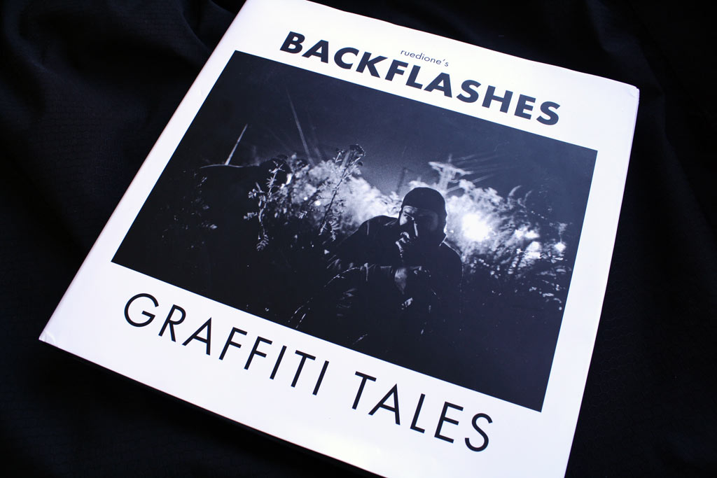
Ruedione’s Backflashes

back_1

Please introduce yourself. Where are you from? When did you start photography? Did you paint before starting photography?

My name is Ruediger Glatz aka Ruedione and i come from the beautiful city of Heidelberg in Germany.

Like many people I’ve shot photos my whole life.  When i was 7-8 I had as well some darkroom moments with my father, but the real start of my photography was in 2000…soon i became a photonerd.

I started to write around `91 but slowed down around `98….today I piece just once a while, but can’t claim myself being an active writer.
My focus is on my photography
back_3

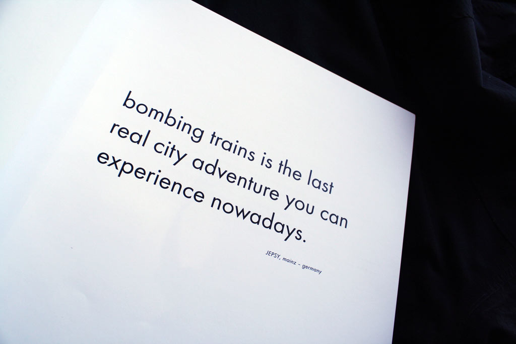
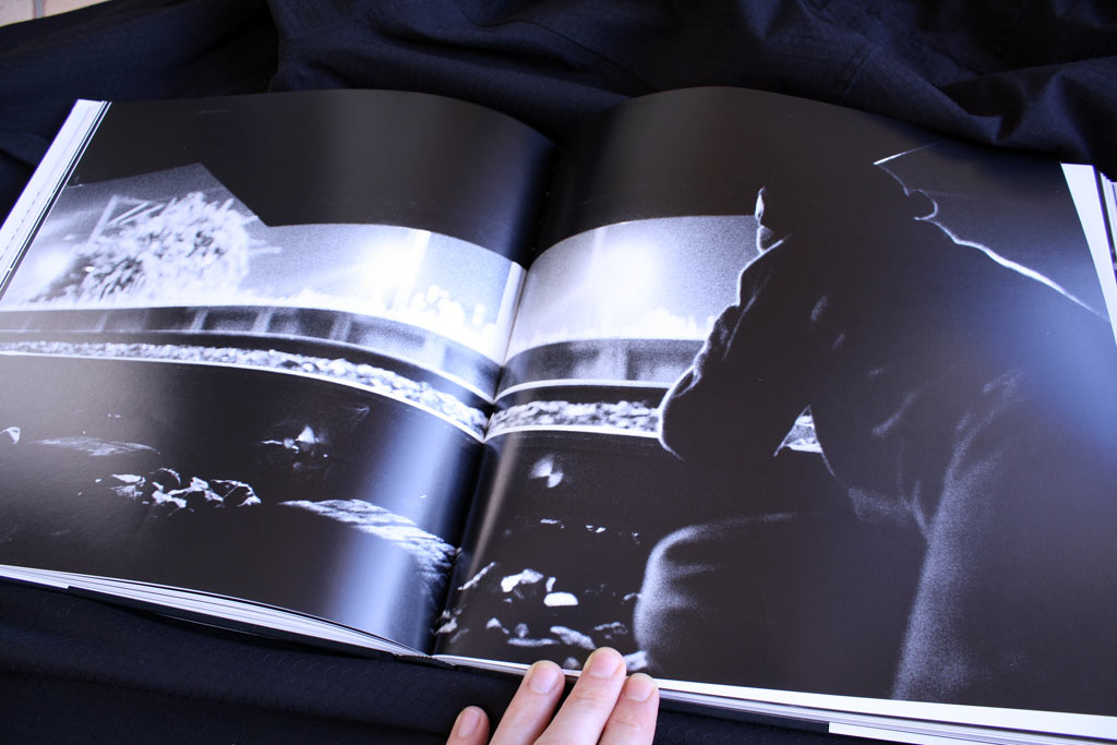
Backflashes is a big book with large pages and only 1 big photo per page. Was it important that your photos were presented on such a big format?

The book was still a compromise for me….if it was only on me, i would have put just one image per doublepage, but i was as well grateful to the publisher, as doing such an uncommercial book in this period of time, while tons of graff books come on the market and most sell way less, than they used to sell, is a certain risk I appreciate a lot.

indeed…this kind of presentation was important to as I want to see my “babies” getting the right focus.  The composition of an image is very important to me…normally i don’t crop my images. I go even so far, that the images in the book, that go over a doublepage and had get cropped for that, fall in my eyes under grafic design and are no more part of my photos in that book.

I personally don’t crop to push myself becoming better. With crops you can easily optimize your images and you don’t  have to focus much while shooting.

The presentation of my images is quiet an emotional point for me.
back_4

Your photos are all in black & white and some are a bit noisy. They look like film photography. And it works great for night photos. Do you like the current trend of clinical precision that allow digital photos? (and by the way, do you actually use digital cameras?)

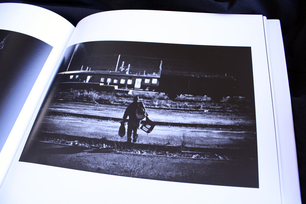
When I started this series in 2002 I was strictly shooting film and the T-MAX3200 gave me the needed speed to shoot this series. I like the grainy and raw look of this film and had the feeling, that this format was supporting my look.

In 2005 i switched to digital, as the first camera came on the market, that gave obviously better results than film plus i found a mentor who opened my eyes for a certain general view on photography.

…but i kept the same look for the series.

Today I shoot mostly digital, but use film for some series.  I experiment a lot with all kind of cameras and always try to push limits.

I am very grateful for the possibilities, that the digital photography gave me, the same time you have to be aware of all kind of risks, that come with that medium.

When i shoot a series i always make up my mind first, what kind of style is underlining my message. I do shoot as well “technical perfect and precise” digital images, but for most of my series i use a retro look, as it gives me the emotional intensity, that i always look for in my images.
back_5

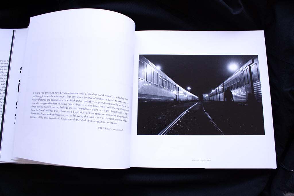
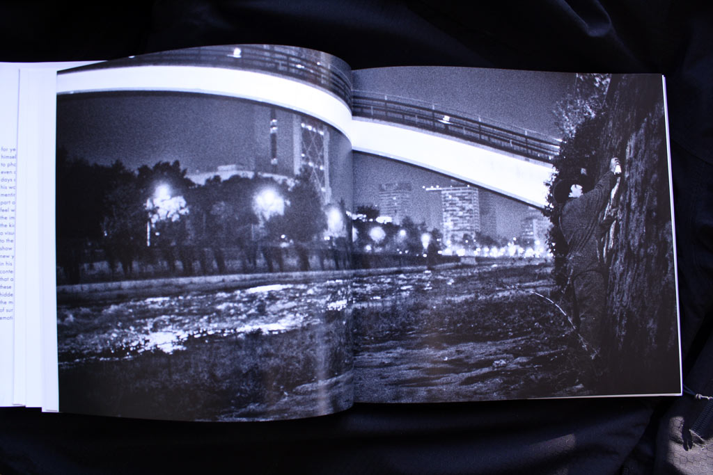
Backflashes must be one of the 1st books about graffiti where it is not shown a single graffiti. Is it a way for you to tell that adrenalin, friendship, tension, & night-missions are what really matters in the graffiti?

I see my book being the second book, as Alex Fakso published his HEAVY METAL in 2006.

My aim was to visualize that feeling that kept me going out at night for so many years. Graffiti -and specifically bombing- influenced my life a lot and i wanted to preserve that precious feeling for me and others, that might be interested in grabbing the book in 10-20-30 years and get a backflash.

The way i chose to shoot the series in, has the focus completely on the feeling….the identities of the persons are totally not relevant…it is even important for me, that they are not being recognized, as graffiti is a movement, that creates idols, who might disturb what I was looking for.

In a way i think that the community aspect of graffiti is probably the most important factor to me, that made this movement so special to me, but this is somehow what my next book is about…i am already working on for 7 years. BACKFLASHES is all about the bombing-feeling itself.

…a piece made for night-lovers.
back_6

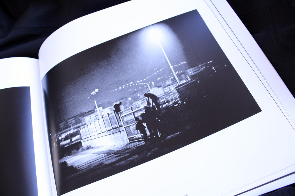
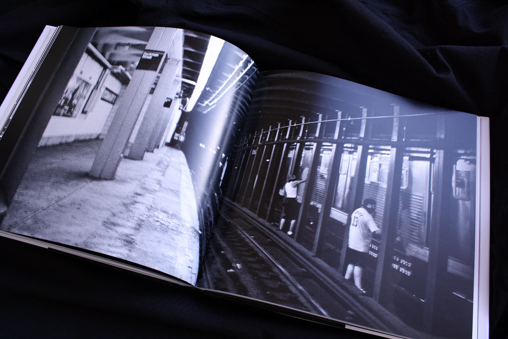
As a former graffiti writer, is it frustrating sometimes to take some risks with people in front of a train and not painting on it?

It is funny…it seems that this is the question almost everybody asks me. The answer is quite simple. Photography is no different than writing for me. It is about style and achieving aims, therefore I always saw myself as part of the production, but in another way. While i spent formerly 7-8 hours on a mission plus had to chase in the morning trains (what was as well special to me) to get my piece, i join today the production and have mostly 10-20 masterpieces in a very basic format on me. Those I can finish in the perfect moment. You could compare it to a writer, who does his firstlines and fills in the yard, but is able to do his outlines at home.

This was always a wonderful way of working for me.

As well i was never able to satisfy my personal view on quality and style in writing, while i am able to do so in my photography. Of course there still has to be a certain challenge, to be able to evolve, but i love my images and it feel like carrying home babies.
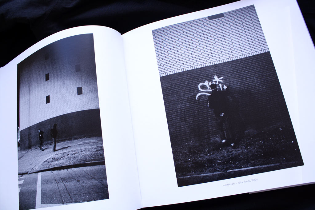
back_7

Which photographers do you admire most? Did some of them influence your own style?

I wouldn’t say that there is a specific photographer, who influenced my style or who i even admire.

When i started in 2000 very soon the images and the approach of MAGNUM photographers like Bresson, Burri and Capa influenced me, but over the years i had the feeling something was missing and it were finally images of the American civil war and other vintage prints, that showed me what i was seeking for.. that influence added darkened edges and a certain retro look to my style. Somehow the opposite of what seems to be perfect to the most is perfect to me … it gives warmth and emotional focus on details to my images and this is what was a bit missing before. I never wanted my photography to be neutral.

Several years ago the concept of “stars” faded for me and today i don’t see any photographer or “star” in general, who I would like to switch life with…i enjoy my life.
ruedione

Is this book the end of a period of you life? Do you still shoot graffiti writers or like Alex Fakso you are now experiencing new photographic themes?

I would say that this book was about a former period of my life, that was even over, when i started shooting…so i called it BACKFLASHES.

Since i started taking photos, the challenge of learning was always a very important matter to me. Therefore i shoot since years as well photos in other directions than graffiti, but i like to separate things. About 4-5 years ago i started to work also as a photographer, but what i shoot job wise has nothing to do with my personal work…but it keeps me learning.

Next to BACKFLASHES i have other long term projects i was working on, and since i finished BACKFLASHES in December 2008, i focus on my series ARTISTS (just a workingtitle), that i started shooting for in 2002-2003.  Here i shoot portraits of around 90-95 protagonists of the graffitimovement. I join them sometimes for a couple days and the focus is on the person and their living environment…this series should be finished by the end of 2010.

…but there are a couple more series. I am addicted to shoot and i enjoy it a lot.
ruedione

And a last one if I visited Heidelberg, which are the places I shouldn’t miss?

It depends on the day, but for sure you shouldn’t miss the ZUCKERLADEN …a crazy candystore with a crazy owner.

I always call Heidelberg “happy land” as everything seems to be alright and good.
backflashessss

http://www.ruedione.com/
http://www.backflashes.com/
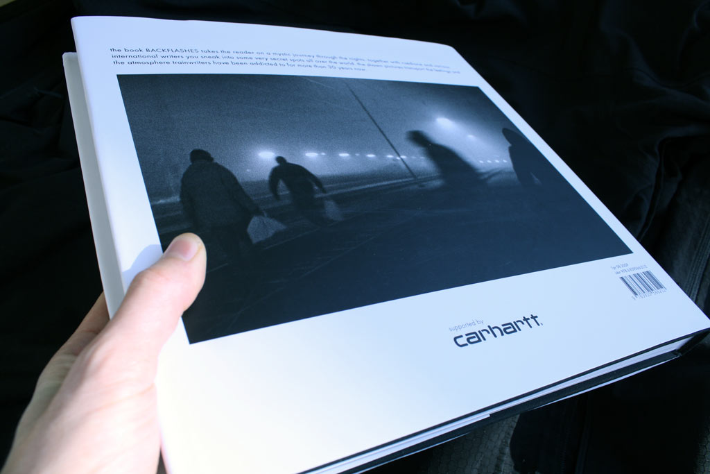
backflashes book

Continue reading
8 Comments

Momo interview

momo rojo book

If you were French, Momo would be a short name for Maurice or Mohamed. Where does this name come from? Where are you from Momo? What five words best describe you?

I’m sure that MOMO sounds better in French.  Its just a silly nickname.  I’m from San Francisco, all my family is; three generations on both sides, but I live in Brooklyn now.  A friend from high school sitting next to me wants to say: “icon”, “positive”, “loves to laugh”, “stylish”, “obsessive” to describe me, but its with a dry sense of humor (and more than 5 words).

Your work is often a mix of clean and sharp shapes and some more spontaneous/random shapes. Does it reflect something about you; a fight between order & freedom? a split personality : Mondrian vs the Sex pistols?

I think you’re right.  I made loads of drawings while in Paris from medieval tapestries that feature crumbling castles (Armageddon imagery) in 2003.  It was “order and disarray”, and since then its interested me.  Entropy… we’re doomed while we’re uptight, and its a confetti party if you let go.  Or how hard I worked all my youth to draw well and now I do scribbles and blobs(?).  There’s also anger, & seeing order destroyed feels good, for stupid fun, and also smart revelation, ’cause order is superficial.

Momo New Orleans

Your work is often based on pasting many geometric colored papers. Do you know where you will display your work when you are working on it? Does the final work look always exactly like what you planned in your studio, or does it change a bit when you paste your material? It looks exactly how I plan it.  I’ve tried other ways, like carrying cut paper that could fill any space, like 100 cut dots or stripes, then spread them like paint anywhere. But I enjoy having as much as possible thought-out, and really collage is not so flexible.

Who is your art for? When did creating art become something important in your life? My art is for anyone at all (seriously, that’s the best), but not everyone.  I was hooked at age 3.  The weird experience was: I was making kids drawings, like wishing I had access to video games: so one character shoots another and you scribble them out…. then I wished I had a camera, so I made drawings to look like photographs, with foreshortening, cropped elements- and adults freaked out.  I thought that was pretty cool.

Momo

There are trends in graphic design and art: Pixels, Deer antlers, drips, stencils… Fluo colors & rhombi were pretty popular recently. Do you feel close to this 80’s revival?
Yikes, no way, none of it.  Its sexy, but I came to the loud color thing from time I’d spent in the Caribbean.  My inspiration is their self taught wide-open use of color, I’d like to avoid “Pop”, retro or otherwise. (more…)

Continue reading
0 Comments

Plakboek, Eindhoven & Erosie

Plakboek

Plakboek has been released for the Dutch Design Week 2008. I think it was not an “urban-art” event, how did you get involved in this ?

Eindhoven is a small city and design is Eindhoven’s claim to fame because of the Design Academy etc. Luckily there are quite some other events during the DDW not directly related to the ‘ pots and pans, chairs and tables’-design, but places where there is a different touch. One of these places is Freek Lomme‘s Onomatopee and his Your-space. He did a lot of the arranging so we were lucky to produce the book.

Actually I think it’s good it was not related to an “urban art event”, it’s good to see genres mix, I never liked that art is only about art, urban only about urban, hiphop only about hiphop etc. There are good and bad things to find in all fields.

Plakboek - Stickers

What was your aim with this book, to make a kind of photo album of the last 10 years in Eindhoven ?

In a way yes. Like a scrapbook should be…Me, space3 and Crackrock wanted a good overview of certain people and certain works that had an impact on Eindhoven’s streets in the past 10 years or so. Next to that of course there are also more traditional tags and old electricity boxes with tags still visible after 15 or even 20 years. Most of these were buffed just recently, so in a way the book shows the ghosts of a past era, and also shows the constant battle with the citycleaners. Also it’s good that a lot of things are put together in one book, unlike big cities there are not so many people constantly going in and out of Eindhoven so a lot of nice things never were seen.

Plakboek - Football

The curator of the exhibition gives a few explanations in the book, but according to you, what made Eindhoven scene special ?

The fact that a lot of people with different backgrounds met in a similar field; producing stuff in the streets that challenged each other to make more and different work. A constructive vibe instead of losing too much energy battling in a negative way. More traditional graffiti always existed next to other expressions, people did both art or design and graffiti and crosshatched these fields. On a personal level all these different people always relatively got along quite well, it’s a small place it makes sense.

erosie_0325

What does Eindhoven look like today ? Is it all buffed ? Are there interesting new comers we should know ?

Yes…it’s mostly buffed and kept clean. Like most other North-European or at least Dutch cities there is apparently enough money to spend on city-cleaning, and it’s done as a “safety measure”; people feel unsafe and the best way to lighten that feeling is a superficial one. Nothing really changes, it looks and feels “better”, so that makes all the difference. It makes sense I guess in a society that is so much about appearance and looks.

Still people do things so there is still stuff to see, but it’s not as vibrant as before. In the bigger picture it makes sense that things change after a 10-year span.

plakboek - stickers

If I visited Eindhoven, which are the places I shouldn’t miss ?

Definitely check out MU, an art space with good contemporary art and changing exhibitions as well as the Van Abbe Museum, look for Arnol, the loudest streetpreacher ever in the center city, he will give you Jesus’ blessings personally, drink a beer or fifteen at the Lafolie-bar, go to Motta artbooks, break a leg in Area51 skatepark, get your infamous Dutch-cuisine lunch at Dik & Lang, try to be at a Stroomhuis-party, and that should be enough for one day to not come back in quite a while…

Van Abbe Museum(cc) Facemepls

We are at the end of an era for what was called street-art last years. Are you still interested in the current scene ?
What artists are you currently excited about?

I really like Influenza‘s ongoing experiments in the research of using and abusing our cities and it’s public spaces…I still can’t get over what Mischa Leinkauf and Matthias Wermke did with their film “zwischenzeit”, it’s so good. Did you see Blu’s latest visit to Barcelona? I saw some beautiful stuff from Adams some time ago that make you realise how far some people push things…Ofcourse it’s interesting to see the developments ( or lack of developments) by our beloved (or not so beloved) streetart superstars and the famegame and moneymachine around it, some change in just a decade! Next to that there are so many things happening it takes too much space to type down…not only in street-related fields but in general. The more you see the less you know…

erosie_0324

Is there any project or collaboration you would love to do but still nobody asked you to ?

I would just like to find a way to bend time a bit more in my advantage.
If somebody can help me with that, that would be really nice.

Erosie

http://www.erosie.net/

http://plakboek-eindhoven.nl/

Continue reading
2 Comments

Objects 3 – Interview with Igor P

objects3

1. Why have you decided to release a 3rd chapter to “Object” ? What makes it different to the 2 previous books ?

I think, street art must convey a message to people and to be totally interactive. In Russia, street art has poor evolution, but I’m always interested in participating to the graffiti subculture evolution. In 2005 year I created a web-site : www.visualartifacts.ru. This web-site supported Russian street art. After a few months the idea came of “Objects” book.
First and second books contained best works of the Russian street artists and explored ex. USSR graffiti scene. In Russia there’s not enough interesting art projects. So, I had the idea of the Red Cube.

objects3_performance

Third issue like the previous one, is mostly dedicated to Russian street art innovation reviews and events in the street art community. But this issue was conceived as something more meaningful than an ordinary street art album.
“Objects” cubed – is a project aimed to stimulate creative experimentation among Russian street artists, a call to overcome two dimensional and typographic street art, which is unfortunately the  dominant trend in Russia. Our goal is redirect artists’ potential into the field of free art unrestricted to the urban surfaces only. So, this third issue is focused on three dimensional objects and space-volume compositions, created by various artists on the streets of the city. It’s the first time when the title reflects the contents so literally.

objects3_2

objects3_3

2. What has been the harder on the making of the book ?

Working on the books I had two big problems: artists are very lazy and are not ready for big projects and unique ideas. European street artists inspired by Russian art works and making a copy-past, this very sad. I think it is a big problem, that disturb evolution Russian artists.

3. Watching you book, we really have the feeling the Russia scene is extremely active with many diversity. But at the same time your latest personal project is named “Russian street-art is dead”?

But evolution cannot exist without experiment. Culture that blindly replicates tradition is a dead culture. One of the main intentions of this title – is a call to discover new areas of experimentation, to employ new media, to invent new forms of street expression, because, unfortunately, only a very few Russian street artists dare to tread new paths…
So, I came to the conclusion, that Russian street-art is dead. This subculture is very small and without evolution, it’s dead. “Russian street-art is dead” it’s my conception now, and my last exhibition confirms that.

objects3_4

4. Can you tell us the name of an artist from Moscow we should know about ?

I don’t really have a new interesting Russian artists to present now. There’s a few artists like me: Scheme, 183, 0331c and Misha Most, but it is not enough.
Right now, I’m working on my own public street-art projects. It’s a bit early to talk about a fourth book.

objects3_5

5. If I visited Moscow, which are the places I shouldn’t miss?

My recommendation art’s place in Moscow:
Moscow P.I. Tchaikovsky Conservatory,
Tretyakov gallery,
The Pushkin State Museum of Fine Arts.

Official web-site: www.objectsbook.ru

With Best Regards, Igor P.
Homepage: www.prokvadrat.ru

You can order Objects 3 from Europe and from Russia.

You can also download the pdf of Objects 2.

objects3_6

Continue reading
5 Comments

Objects 2 to download

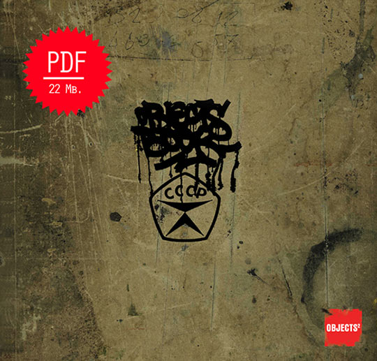
Igor who was the chief editor of Objects 2 offer us the PDF file of his sold-out book.
It is a great opportunity to discover or know more about the Russia street-art scene.
??????? ??????? !

Igor is working on a 3rd book about 3D objects and installations in the street.

Objects 2 – Pdf file 20mb

edit [march 2009]: the 3rd book is out !

Continue reading
5 Comments